|
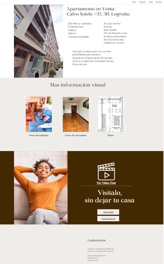
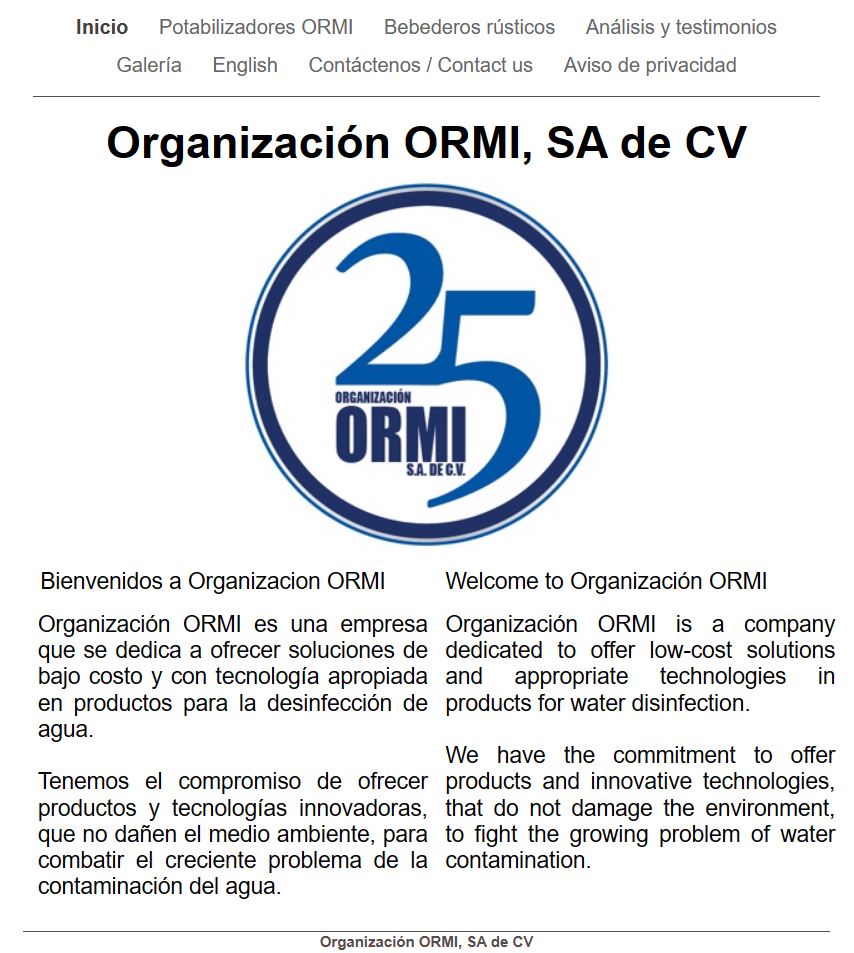
Having an updated and presentable website is crucial for businesses of all sizes. Your website serves as the online face of your brand, often forming the first impression potential customers will have of your business. A well-designed and informative website, not only enhances your credibility and professionalism, but also acts as a powerful marketing tool that enables you to reach a wider audience and attract new customers. Moreover, in a competitive marketplace, a visually appealing and user-friendly website sets you apart from your competitors and instills trust in your audience. It provides a platform to showcase your products or services, share valuable content, and engage with your customers effectively. An updated website allows you to adapt to changing trends and stay relevant, ensuring that your business remains competitive. Regardless of the size of your bussiness, investing in a well-designed, user friendly but effective website is essential for establishing a strong online presence, fostering customer loyalty, and driving business growth. Our client below, had neglected the website for years, and while it had decent traffic in terms of how many people landed there monthly while searching for Mexican products, the website failed to generate business or proper interest due to its lack of relevant information to the current offers. We created a whole new website and included an online store, opening up a whole new channel to monetize from. The client specifically asked that we maintained a similar look and vibe as much as possible, which is why the style is quite reminiscent of the original, however it's usability and functionality significantly improved. BeforeAfterIn addition to creating digital photography and a video tour for this property, we created a marketing plan for it to be shared with all the regions real estate professionals. Through that we came to decide the best decision was to display the property's information as best as we could ourselves, and then share it as a packet. We made this simple, custom website that only displays the property we are interested in marketing, and then we followed by contacting all the local agents for them to be able to offer the property to their clients as easily as possible. This small, dedicated website, is clear and straight to the point. Shares images, video and floorplan of the property with any likely buyers.
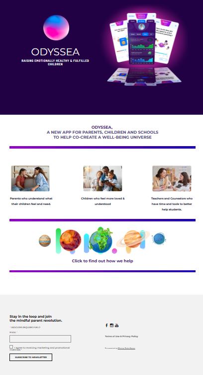
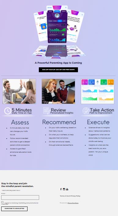
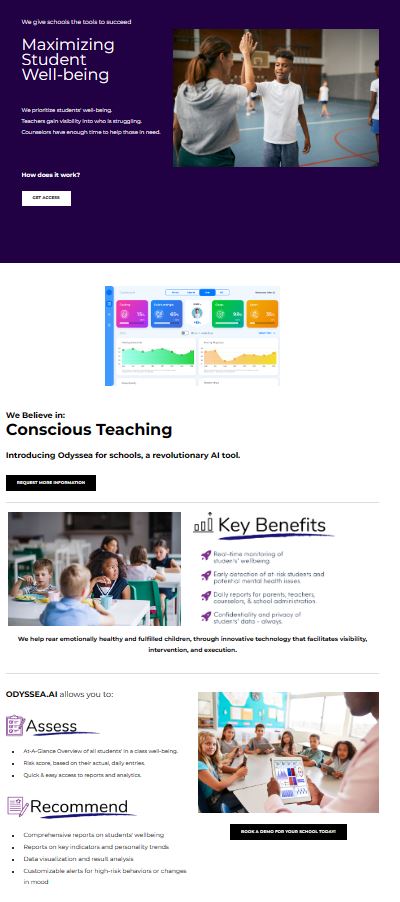
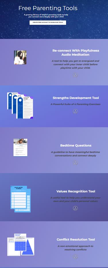
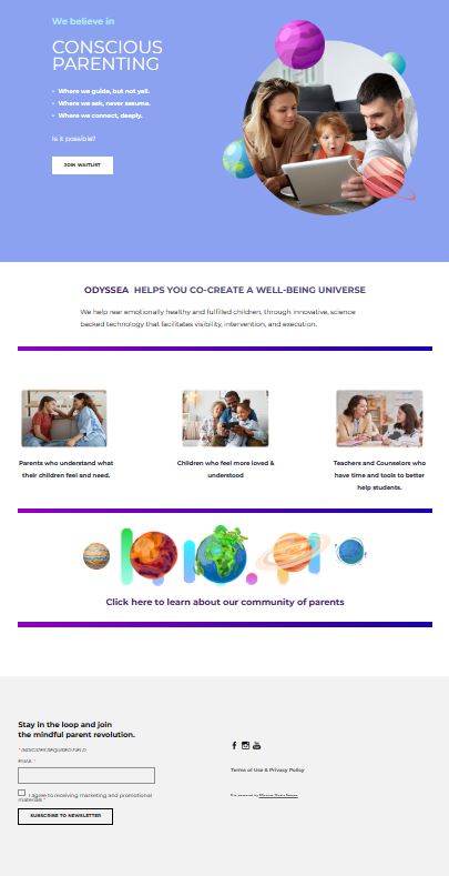
Turn around for a project like this is about 3-5 days. Odyssea.ai was a medium-sized web-design project with a very robust website. We created custom graphics, and a custom website design with multiple iterations as the company evolved. The website has a members area with access to member-only downloads, as well as a blog and it was linked to all of their social media channels. It also has separate sections to cater to both their b2c, and b2b customers.
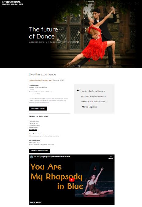
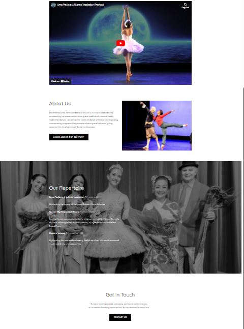
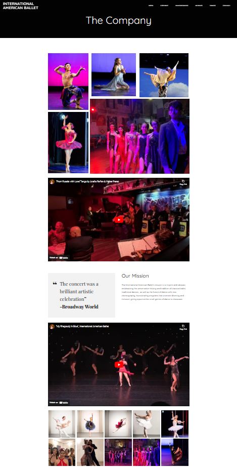
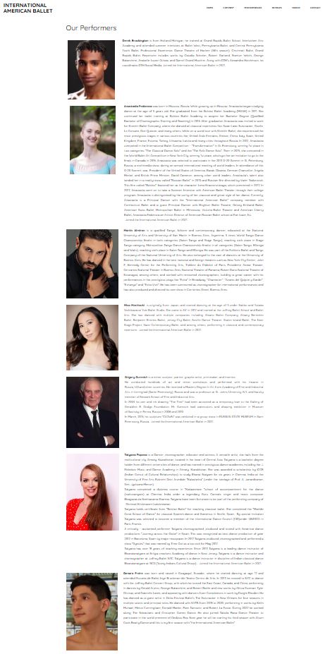
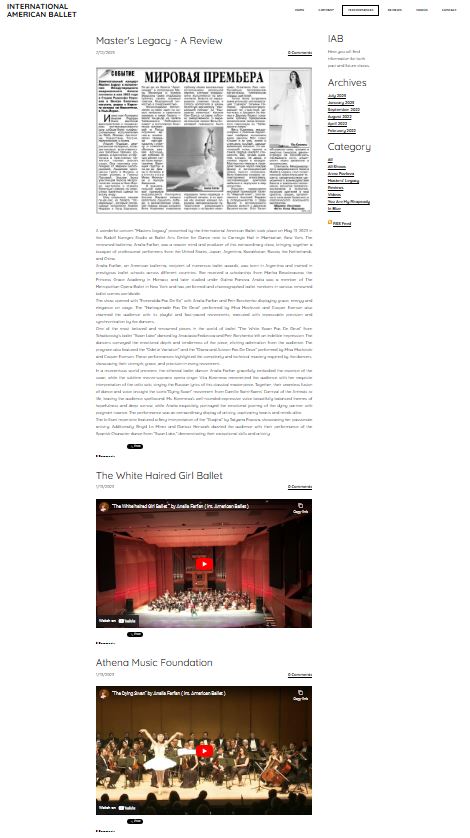
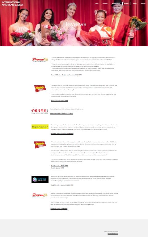
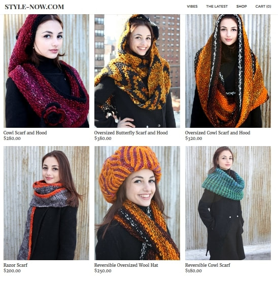
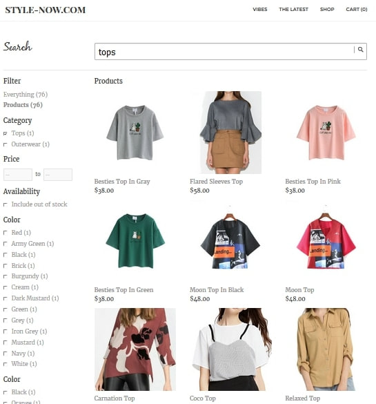
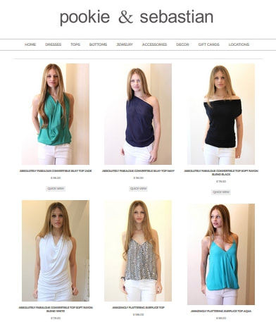
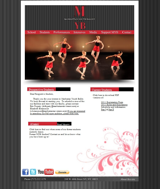
The International American Ballet, is a professional classical ballet company based in New York City. We designed and built a website to showcase their work, announce upcoming performances, display videos of their past performances, as well as provide information about the company and its members. www.InternationalAmericanBallet.com We love working with companies in the arts. From having a background in the arts, specifically in theater arts, we have a great understanding of the needs of a company within the industry. Before there was The Real-Real, there was Tatiana's Designer Resale. The queen of designer resale, would cater to the Upper East Sider fashionista on a budget as well as help the not-on a budget Upper East Siders recycle their digs. I created a stylish clean website where the clothes were the main focus and you could see the unique items details in a high end digital environment. I started doing jewerly photography for Pookie and Sebastian, for them to have an internal catalog. Upon a couple weeks of photographing for them I came to the realization that they didn't have a proper website. They just had a landing page with the addresses to all of their locations.
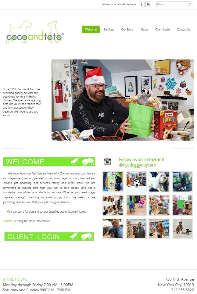
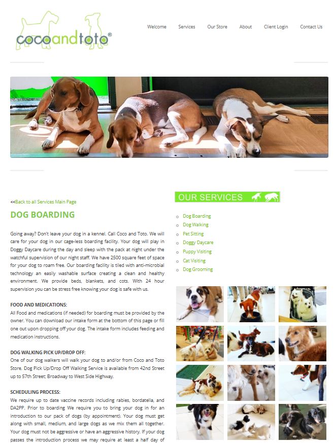
After many discussions, I convinced the owners to go digital and launch the online store, which I developed from scratch for them and created a system where they could pull inventory directly from the store and not incur in any further expense by having to stock additional inventory for just the web location. An online store is a full additional branch for any business. By spearheading the transition to digital for Pookie and Sebastian, I witnessed firsthand the transformative power of an online presence. Not only did it expand their reach beyond physical locations, but it also streamlined their operations and inventory management. With the new website in place, customers could now browse their entire collection from the comfort of their homes, leading to increased sales online, as well as the brick-and-mortar locations It also helped with brand visibility. The ability to use inventory directly from the store saved the business both time and money. An online store is a necessity for businesses looking to thrive and adapt to evolving consumer demands. For more information and posts on this client: Visit Social Media Management for Pookie and Sebastian For Coco&Toto NYC, we designed and built a brand new website. www.CocoandToto.com
This website is informational and practical as it not only provides all the information clients might need in a very organized way, it also has all the forms a client might need to download prior to requesting their services. We also offer web-hosting and maintenance services, so to this day we host and maintain their website. We work with them periodically to make updates and changes to their site. Unfortunately, I don't have a better archive image for this website. This early project had custom graphics that were quite special, as clickable buttons on the site were made using elements found in the medical office.
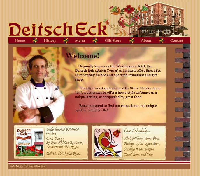
The company used this site until they closed due to the doctor's retirement from practice. For them, we created a great website with custom graphics, a clear explanation of the services offered, as well as integrated a booking system for ease of appointment setting. This is one of our favorite projects from our early beginnings. The Deitsch Eck restaurant is an authentic Pennsylvania Dutch restaurant located in Allentown. Although this website has now changed into a different more modern variation, the design below truly captured the feel and vibe of the business. For this project, we traveled to the location, took photos of the space and the staff and owner, and created custom graphics utilizing elements found in the restaurant. The background of the website was the actual wall paper in parts of their dining room, so for those visiting the site and the restaurant, it truly gave a 360 experience.
The clients in this example had a perfectly clean looking and functional website, but many times it is important to update the company's image in order to let the clients see you are staying up-to-date with the times.
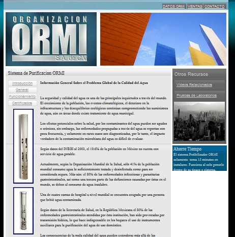
Although this example is quite old, it shows what we did for the clients, we completely redesigned their site to a more functional version which was easier to use and understand their product, as well as created an updated logo that projected a stronger image, and a contemporary feel. |
Archives
May 2024
Categories
All
|





 RSS Feed